

Favorite UI - most pleasing to the eyes...
-

- KVRAF
- 6113 posts since 7 Jan, 2005 from Corporate States of America
I'm happy to see no representation from the "flat and minimal" camp 
- dysamoria.com
my music @ SoundCloud
my music @ SoundCloud
-

- KVRist
- 136 posts since 14 Jul, 2006 from Berlin, Germany

Don't know why... I like the look...
Lenovo_L412_i5-520m_@_2.4GHz|8GB_RAM|120GB_SSD|128GB_extMemory|Win_7|Live_9.7.7|volca_sample|Novation_Launchpad_Mk2-Launch Control_XL_Mk2-Audiohub_2x4-Circuit|Kaoss_Pad_Mini_2S|Allen&Heath_ZEDi-10|various_PlugIns|Tab_A6|Mazetools_Soniface
-
- KVRAF
- 35439 posts since 11 Apr, 2010 from Germany
I'm sure someone will post a ValhallaDSP plugin soon enough.Jace-BeOS wrote:I'm happy to see no representation from the "flat and minimal" camp

-

- KVRian
- 1375 posts since 6 May, 2005 from Michigan, USA
After all this time, I think the one I still find most pleasing to look at when I bring it up is Massive. Just the right balance of grey tones and color. It's just an elegant, slick bit of design to me - neither overly minimalist and dull nor going over the top into gaudy.
You do not have the required permissions to view the files attached to this post.
http://www.davidvector.com
New album, Chasing Fire, out now on Amazon, iTunes, etc.
Bandcamp: https://davidvector.bandcamp.com/releases
New album, Chasing Fire, out now on Amazon, iTunes, etc.
Bandcamp: https://davidvector.bandcamp.com/releases
-
 UltimateOutsider UltimateOutsider https://www.kvraudio.com/forum/memberlist.php?mode=viewprofile&u=216800
 - KVRian
- 810 posts since 5 Oct, 2009 from Portland, OR
u-he Hive, not just for looks but usability.
And Native Instruments Monark is still damn beautiful.
And Native Instruments Monark is still damn beautiful.
-

- KVRAF
- 1645 posts since 12 Dec, 2012 from Switzerland

-
- KVRist
- 389 posts since 22 May, 2012

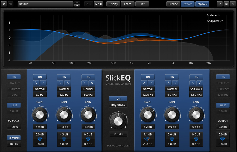
+1 on FabFilter
-
- KVRAF
- 5818 posts since 9 Jul, 2002 from Helsinki
Except for that Circle posted above and several mentions of Madrona Labs Aalto, which I also find rather pleasant to watch and use.Jace-BeOS wrote:I'm happy to see no representation from the "flat and minimal" camp
Flat or 3D, in the end what matters is how well it's designed. Most fake 3D UIs tend to get old really fast.
Reaktor Blocks look good, but some combinations aren't that easy on the eyes. Also, not a synth, but all TDR plugins are very clear and stylish.
-
- KVRAF
- 6113 posts since 7 Jan, 2005 from Corporate States of America
The quality of flat design varies, sure, but I'm not seeing egregious examples of its stereotypical shittiness with the flat bits in the screenshots here. Most screenshot here is nice stuff, with depth on elements (or at least clarity of function and controls large enough to interact with). Though I'd adjust some things, given the chance, in certain GUIs shown here, I find most of these to be quite nice. That tells me that the people posting either have good taste... or that the general opinion of what makes a nice GUI really does involve using depth and detail, and that flat stuff is rarely nice enough to win any contests on aesthetics or usability. 
- dysamoria.com
my music @ SoundCloud
my music @ SoundCloud
-

- KVRAF
- 21196 posts since 8 Oct, 2014

