

How large should a UI be at the most? Post your opinion.
-
- KVRist
- 446 posts since 14 Dec, 2014
Let those developers please use tabs. I dislike the all-functionality-on-one screen, in fact it prevents me from using most of these synths beyond the preset functionality.
Last edited by Dúnedain on Fri Feb 06, 2015 9:00 am, edited 1 time in total.
Dúnedain
-

- KVRAF
- 12555 posts since 7 Dec, 2004
Again, tabs vs. no tabs. Don't listen to customers, they're terrible at explaining what they want.
If you use tabs they'll complain that you ought to have used a single screen.
If you use a single screen they'll complain you ought to have used tabs!
Focus on quality design and ignore the complainers. The best solution will emerge from your effort, not from whatever bullshit they come up with to complain about.
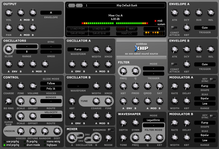
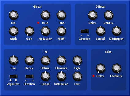
Free plug-ins for Windows, MacOS and Linux. Xhip Synthesizer v8.0 and Xhip Effects Bundle v6.7.
The coder's credo: We believe our work is neither clever nor difficult; it is done because we thought it would be easy.
Work less; get more done.
The coder's credo: We believe our work is neither clever nor difficult; it is done because we thought it would be easy.
Work less; get more done.
-

- KVRian
- 1032 posts since 26 Jun, 2008 from Czech Republic
A lot of laptops are still made with 1366x768 resolution screen. I used to use one for productions and I remember hating those plugins with more than 700px height. Might not be relevant opinion, but if your UI has to be static, I'd go for 700px height maximum.
Evovled into noctucat...
http://www.noctucat.com/
http://www.noctucat.com/
-

- KVRAF
- 25468 posts since 3 Feb, 2005 from in the wilds
The largest size that will fit on most peoples screens is then too small for quite few people.ENV1 wrote:Like the title says.
How large should a static (i.e. non-resizable) UI be at the most.
The idea is to find out where the point is when most people would find a UI too big.
Of course that is dependent on the nature of a plug-in. A small plug-in is fine if it only has a handful of parameters. But for a complex synth, a re-sizable GUI is a practical necessity these days
-
- KVRAF
- 35448 posts since 11 Apr, 2010 from Germany
A good GUI is essentially important. Tabs are a very bad thing because they keep you from being able to quickly dial in changes. Really, building a good GUI isn't exactly rocket science. Just take a look at what's considered a nice, easy to use GUI, take what you consider good aspects of it, and build the GUI around it. A good GUI would be something with about 90% of the essentials things accessible from the first screen, and maybe 10% which isn't so frequently used in the background, or even tabbed. E.g. you can easily tab effects, as they don't need to be accessible all at once.aciddose wrote:Again, tabs vs. no tabs. Don't listen to customers, they're terrible at explaining what they want.
If you use tabs they'll complain that you ought to have used a single screen.
If you use a single screen they'll complain you ought to have used tabs!
Focus on quality design and ignore the complainers. The best solution will emerge from your effort, not from whatever bullshit they come up with to complain about.
Btw, an example of how not to do it would be the Zynaddsubfx GUI, it's the most horrible thing i ever used. Synthmaster is pretty complicated and messy too. GUI's which are clear and nice to use: Dune 1/2 (nearly perfect), Cableguys Curve, Largo, Synth1 (thought a bit fiddly due to the lack of contrast and parts), TAL-Noisemaker (very good too)...
-
- KVRian
- 758 posts since 5 Jun, 2001
i like the way U-He are doing it now, with 10% increments from small to massive
-

- KVRAF
- 4534 posts since 17 Jun, 2013 from very close to Paris, France
For me the most important is not the total size of the GUI. It is the perfect readability of all its content:
The total size of a GUI should never be a problem as soon as these rules above are respected.
When I see your two GUIs, aciddose, I'm really happy because precisely you have perfectly respected ALL these rules in both GUIs! That's really nice!
- The density: number of elements per surface.
- The isolation of the groups: there must not be any confusion on the belonging of an element to a group and not to the group which is just beside or just below or just above.
- The readability of the elements : their size must be enough to show clearly their value by their position without any doubt, especially the position of the knobs in their rotation, and the switches in their position. And the colours of all the elements (even the leds) must be chosen to have an excellent contrasts.
- The readability of the serigraph : same remarks, the size of the letters and symbols and their contrasts on the background. And the font also must be correctly chosen to not introduce any difficulty (the best is certainly Verdana).
The total size of a GUI should never be a problem as soon as these rules above are respected.
When I see your two GUIs, aciddose, I'm really happy because precisely you have perfectly respected ALL these rules in both GUIs! That's really nice!
Build your life everyday as if you would live for a thousand years. Marvel at the Life everyday as if you would die tomorrow.
I'm now severely diseased since September 2018.
I'm now severely diseased since September 2018.
-
- KVRian
- 1435 posts since 27 Apr, 2012
If you must have a non-resizable GUI, I vote no bigger than 900 * 675 px. I have a 1280 * 800 px screen and use FL studio, so I have to use detached mode for anything with a height greater than 675 px or so or else I can't access the entire interface. Any higher than 775 px and I can't see parts of the interface no matter what I do. 900 px for width to give room for vertically-oriented groups of DAW controls on the sides of the screen. I imagine for people who have large and/or high-res screens, a plugin that size actually wouldn't be very big at all, though. Solution: if not a dynamically-scalable GUI, than at least a couple different sizes meant to allow the plugin to be usable to people with both small and large screens.
Last edited by Greenstorm33 on Thu Feb 05, 2015 11:05 pm, edited 1 time in total.
-

- KVRAF
- 25852 posts since 20 Jan, 2008 from a star near where you are
About the same as non-informative replies in the KVR forumSJ_Digriz wrote:how long is a piece of string?
-
fluffy_little_something fluffy_little_something https://www.kvraudio.com/forum/memberlist.php?mode=viewprofile&u=281847
- Banned
- 12880 posts since 5 Jun, 2012
Usually the problem is GUI's that are too small rather than too big.ENV1 wrote:Like the title says.
How large should a static (i.e. non-resizable) UI be at the most.
The idea is to find out where the point is when most people would find a UI too big.
-
- KVRAF
- 1516 posts since 20 Feb, 2003
Since there's not one size of screen, the only acceptable answer is to create GUI's which can scale.
Several 4k 40 inch desktop monitors (60Hz native VA based panels) will start to appear over the next few weeks, and they'll be priced below $1,000. Those prices will fall further as Chinese panel makers increase their activities in the Western markets. As a result, larger affordable 4k screens are going to make 4k a common computer screen resolution sooner than many people realize.
You're going to tell someone, with a screen like that, they should be limited to a postage stamp because some guy wants to run things on a 10 year old laptop screen? The only way to keep as many people happy, as possible, is to accept you need GUI's which can scale.
Though I'd much rather see complex synths be able to display more on screen, with increased resolutions, rather than simply increase the size of everything.
-
- KVRian
- 505 posts since 2 May, 2014
Or, usually the problem is GUIs that are too big rather than too small.fluffy_little_something wrote:Usually the problem is GUI's that are too small rather than too big.ENV1 wrote:Like the title says.
How large should a static (i.e. non-resizable) UI be at the most.
The idea is to find out where the point is when most people would find a UI too big.
-
- KVRian
- 505 posts since 2 May, 2014
Resizable GUIs? Trying moving your head nearer to the monitor. 
My 2 year old laptop (not 10) has a resolution of 1600 x 900. Anything much more than 700 pixels high is too big for me.
My 2 year old laptop (not 10) has a resolution of 1600 x 900. Anything much more than 700 pixels high is too big for me.
-

- KVRAF
- 1986 posts since 29 Apr, 2010 from NYC
BlackWinny wrote:For me the most important is not the total size of the GUI. It is the perfect readability of all its content:If these rules are respected, it doesn't really care if there are tabs or not. The presence of tabs appears by real necessity simply when the density becomes to much important or when the developer feels that it is better for him in order to manage his code (it is a very good reason of course).
- The density: number of elements per surface.
- The isolation of the groups: there must not be any confusion on the belonging of an element to a group and not to the group which is just beside or just below or just above.
- The readability of the elements : their size must be enough to show clearly their value by their position without any doubt, especially the position of the knobs in their rotation, and the switches in their position. And the colours of all the elements (even the leds) must be chosen to have an excellent contrasts.
- The readability of the serigraph : same remarks, the size of the letters and symbols and their contrasts on the background. And the font also must be correctly chosen to not introduce any difficulty (the best is certainly Verdana).
The total size of a GUI should never be a problem as soon as these rules above are respected.
When I see your two GUIs, aciddose, I'm really happy because precisely you have perfectly respected ALL these rules in both GUIs! That's really nice!
so wait...both of those appear blurry in the post (because they are enlarged)...if i use "view image" on them...is that the actual size they are?
because they are both unusably small on my 2560x1080 monitor.


-

- KVRAF
- 2946 posts since 31 Jan, 2003 from Ghent, Belgium
How big do you want to see that pixel?1wob2many wrote:Resizable GUIs? Trying moving your head nearer to the monitor.
Resizable GUIs are great, but a few fixed sizes are fine for me too.
I use a 1080P laptop screen, so I like big GUIs. Not only do they fit better on my screen, they have a good resolution. I can always zoom in on the small ones (e.g. Arturia Modular), but they look terrible - text & knobs comprising of few pixels.
If I had a 1280x... screen, I'd not want a small interface, I'd want a better screen!
