
The letters seem blur... No ?Breeze wrote:I did this earlier today but didn't have time to post it. It's the BIG GUI but with the Gamma and Exposure up. I don't find it's perfect (the fonts may be the reason), but it's more legible than the original from a distance (and you can still see the cursor-shadowed letters):BlackWinny wrote:The best would be both, so that I can verify that everything is fine with both sizes.gunnare wrote:Is it the BIG GUI background you want?
- Breeze's image -

Memorymoon ME80 going 64 bit
-

- KVRAF
- 4534 posts since 17 Jun, 2013 from very close to Paris, France
Build your life everyday as if you would live for a thousand years. Marvel at the Life everyday as if you would die tomorrow.
I'm now severely diseased since September 2018.
I'm now severely diseased since September 2018.
-
fluffy_little_something fluffy_little_something https://www.kvraudio.com/forum/memberlist.php?mode=viewprofile&u=281847
- Banned
- 12880 posts since 5 Jun, 2012
I am not into EDM, but I must admit I also don't need the entire dynamic range, far from it. If you play Mozart you might need that sensitivity, but with most modern music one only needs a relatively small fraction of the full dynamic range. I remember testing a synth which did not have a velocity control and was hardwired to full sensitivity. That sucked as I am anything but a trained piano player.Rob James G wrote:Velocity varies in practice, ignoring non linear curves that are a band aid for poor design.
I have been through numerous keyboards. The A800 has a lovely velocity sensitivity. tracking intensity differences between zero and 127 well. Many keyboards fail to meet Midi specification and fail to give full 127. Thus they lose dynamics. For a lot of players velocity sensitivity hardly matters, they intentionally switch it off, particularly EDM stuff. On some soft synths (and most Pianos sounds) this failure to offer full output wrecks the potential for dynamics and/or realism.
Well if we are talking real volume sellers look between £20-£60 on Amazon and Maplin.
I expect many AT keyboards never have the AT feature used in their whole lifetime.
-
fluffy_little_something fluffy_little_something https://www.kvraudio.com/forum/memberlist.php?mode=viewprofile&u=281847
- Banned
- 12880 posts since 5 Jun, 2012
That is already quite an improvementBreeze wrote:I did this earlier today but didn't have time to post it. It's the BIG GUI but with the Gamma and Exposure up. I don't find it's perfect (the fonts may be the reason), but it's more legible than the original from a distance (and you can still see the cursor-shadowed letters):BlackWinny wrote:The best would be both, so that I can verify that everything is fine with both sizes.gunnare wrote:Is it the BIG GUI background you want?

-
- KVRAF
- 1895 posts since 13 Oct, 2002
And quite obvious when you A/B it against the original; it's really a simple fix. Actually, I don't find the cursor shadows to be of any practical use; it's an interesting effect, but IMO it's a lot more important to see the cursor position and labels. I wouldn't say no to getting rid of that effect altogether.fluffy_little_something wrote:That is already quite an improvement
-
- KVRAF
- 4534 posts since 17 Jun, 2013 from very close to Paris, France
I agree. It's even disturbing in a GUI already quite dense...Breeze wrote:And quite obvious when you A/B it against the original; it's really a simple fix. Actually, I don't find the cursor shadows to be of any practical use; it's an interesting effect, but IMO it's a lot more important to see the cursor position and labels. I wouldn't say no to getting rid of that effect altogether.fluffy_little_something wrote:That is already quite an improvement
Build your life everyday as if you would live for a thousand years. Marvel at the Life everyday as if you would die tomorrow.
I'm now severely diseased since September 2018.
I'm now severely diseased since September 2018.
-

- KVRAF
- 23103 posts since 7 Jan, 2009 from Croatia
Breeze, now it looks too... grainy? :/
-
- KVRist
- 72 posts since 9 Aug, 2014
This is slightly reduced quality in order to post.
This is original image with a smidge of sharpness and improved contrast in Picassa.
This is original image with a smidge of sharpness and improved contrast in Picassa.
You do not have the required permissions to view the files attached to this post.
-
- KVRAF
- 1895 posts since 13 Oct, 2002
It appears that the font sharpness is based on the size and enlargement of the fonts. Unless I'm mistaken, the text isn't "baked" into the background but overlayed, which means that the fonts have to be changed for higher res ones in the higher res GUI for that improvement to be workable. This is what BlackWhinny has graciously offered to work on. For the background, however, the usual tools will work although a full redraw in the higher resolution would be even better.Rob James G wrote:This is original image with a smidge of sharpness and improved contrast in Picassa.
It always was. Now it's just more obvious.EvilDragon wrote:Breeze, now it looks too... grainy? :/
Last edited by Breeze on Fri Aug 22, 2014 11:35 am, edited 1 time in total.
-
fluffy_little_something fluffy_little_something https://www.kvraudio.com/forum/memberlist.php?mode=viewprofile&u=281847
- Banned
- 12880 posts since 5 Jun, 2012
One of the problems - not just with this synths - is that they used only capital letters. On a hardware synth that is ok as it is much bigger, but on a GUI the letters are too close together and it is a pain to read. (I just translated a page of Legalese, it was also written with caps lock on, it is so hard for the eye and mind to read). If only the first letter of a word were capitalized (except VCA etc. of course), one could use a bigger font to begin with.
-
- KVRAF
- 1895 posts since 13 Oct, 2002
In this case though this choice appears to be mostly faithful to the original synth:fluffy_little_something wrote:One of the problems - not just with this synths - is that they used only capital letters...
-
fluffy_little_something fluffy_little_something https://www.kvraudio.com/forum/memberlist.php?mode=viewprofile&u=281847
- Banned
- 12880 posts since 5 Jun, 2012
Oh yes, of course. I guess almost all hardware synths used caps, but then again, they are 5 or more times as wide as plugin interfaces 
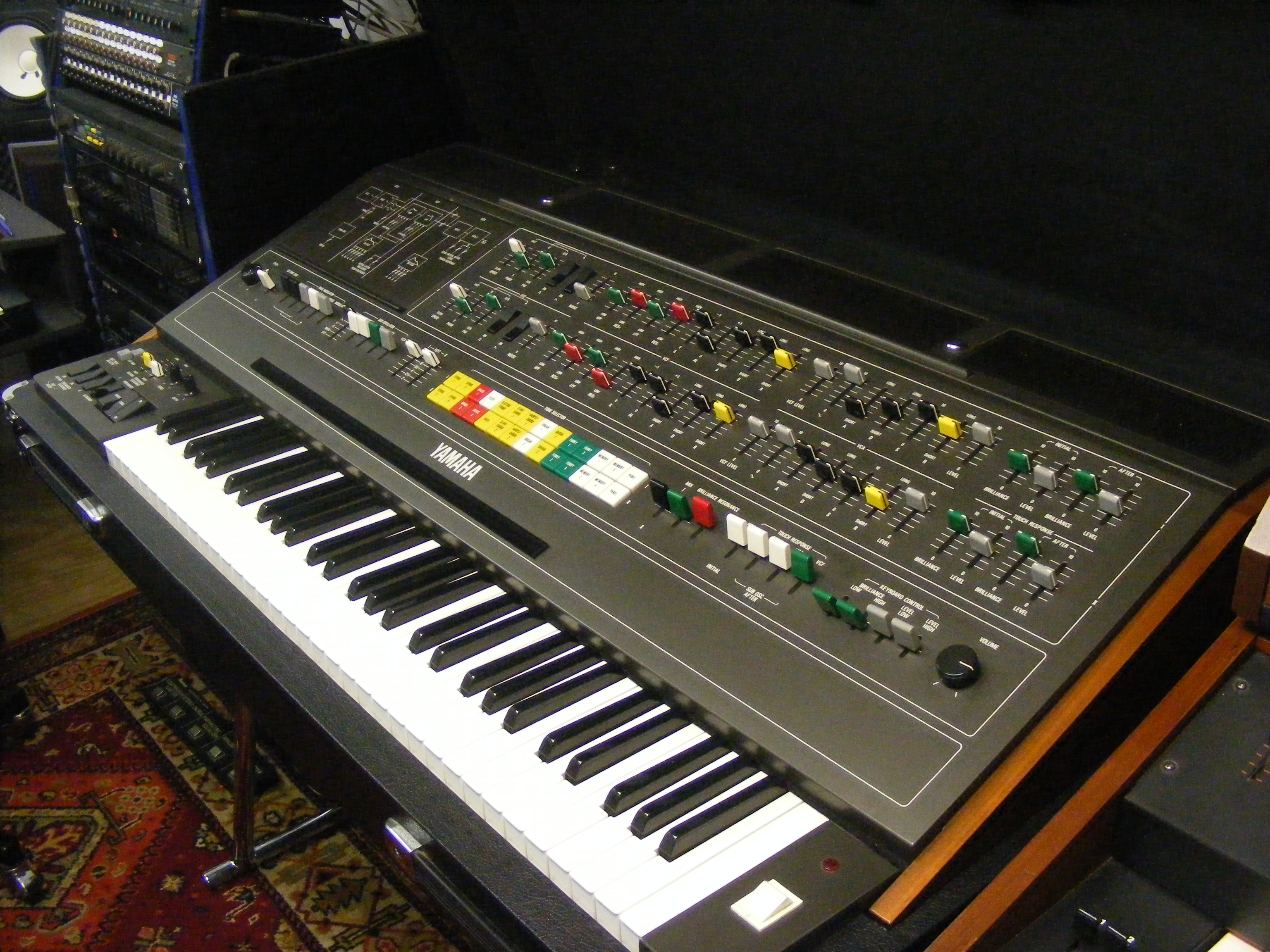
At my browser zoom of 175% this pic seems to be be more or less the real size:
http://medias.audiofanzine.com/images/n ... 174978.jpg
I just noticed from that photo that the performance sliders are not really linear sliders, but circular ones, no matter what they are called. I assume that is why they look so odd in the software, light and shadow are not correct when pushing those controls north...
-

- Banned
- 1181 posts since 24 Jun, 2014 from Giza Plateau
I tried hard to be a fan of your productions but i couldn't find something.fluffy_little_something wrote:I don't know who that one guy is, but I don't like Vangelis' music, eitherIt is a strange mix of bombastic and kitschy, neither of which I like. It has no rhythm and doesn't touch me, just like classical music...
I have no idea why people on this board are so obsessed with certain musicians, almost like groupies. That's just not me. When I read Blade Runner these days, my mind switches to bypass mode
Each to their own...
║▌║█║▌│║▌║▌█
-
fluffy_little_something fluffy_little_something https://www.kvraudio.com/forum/memberlist.php?mode=viewprofile&u=281847
- Banned
- 12880 posts since 5 Jun, 2012
So? That's the old and wrong assumption that one has to do better oneself before one is allowed to criticize others...
For instance I can say that the food I am being served at a restaurant tastes like crap. And I can say that even though I don't know how to cook at all myself.
Anyway, I am NOT saying Vangelis sounds like crap, I just don't like his music, it doesn't appeal to me.
For instance I can say that the food I am being served at a restaurant tastes like crap. And I can say that even though I don't know how to cook at all myself.
Anyway, I am NOT saying Vangelis sounds like crap, I just don't like his music, it doesn't appeal to me.
-
- KVRist
- 72 posts since 9 Aug, 2014
If you look at the image I haven't used a captured image of the GUI, unlike the previous posting.Breeze wrote:It appears that the font sharpness is based on the size and enlargement of the fonts. Unless I'm mistaken, the text isn't "baked" into the background but overlayed, which means that the fonts have to be changed for higher res ones in the higher res GUI for that improvement to be workable. This is what BlackWhinny has graciously offered to work on. For the background, however, the usual tools will work although a full redraw in the higher resolution would be even better.Rob James G wrote:This is original image with a smidge of sharpness and improved contrast in Picassa.
It always was. Now it's just more obvious.EvilDragon wrote:Breeze, now it looks too... grainy? :/
It is the separate PNG file of the background graphic without any of the controls and keyboard.
So the text that you see is part of a static image, part of the artwork. Of course this could be scrubbed out in an art package and redone. However this was a simple (temporary) solution before the artwork is redone by a professional. I have compared it side by side, it is marginally better.
