
Great callout! This tripped me up a few times and I should've thought to mention it to Ploki earlier. I agree that the top-row/bottom-row approach Teksonik is suggesting would be an improvement.
Latest News: u-he releases Sugar and Spice for Hive 2
Swarm - New GUI for Hive2 [OUT NOW]
-
Funkybot's Evil Twin Funkybot's Evil Twin https://www.kvraudio.com/forum/memberlist.php?mode=viewprofile&u=116627
- KVRAF
- 11558 posts since 16 Aug, 2006
-

- KVRAF
- 18603 posts since 16 Sep, 2001 from Las Vegas,USA
Yes it caught me out this morning. I switched back to the original skin for a moment and realized I had selected mod slots 1 and 3 when I thought I had selected 1 and 2. I didn't even bother to look at the numbers on the Ploki skin as I just assumed it went 1,2,3,4 etc.
None are so hopelessly enslaved as those who falsely believe they are free. Johann Wolfgang von Goethe
-
- KVRAF
- Topic Starter
- 6527 posts since 17 Dec, 2009
Ah the dread matrix knobs - thanks!
Good question, i guess because i patch I use the last couple for constants so they end up on the right, and dynamic (LFOs/MIDI) on the left, it's a habit i picked from the original skin so i had "something on page 1 and something on page 2" and i mentally split them by the middle.
However the big matrix in the middle follows 1/2 horisontal convention, so it's probably makes much more sense to keep the two-row config instead.
I'll switch it to two-row!

-
- KVRist
- 214 posts since 4 Feb, 2015
This does not look nice IMO. The dark transparent cover cuts through the display.
Wouldn't it be better if the whole FX module (in this example "Phaser") would be covered up when being inactice? This would also imply that on the right there are no rounded corners.
Wouldn't it be better if the whole FX module (in this example "Phaser") would be covered up when being inactice? This would also imply that on the right there are no rounded corners.
You do not have the required permissions to view the files attached to this post.
-
- KVRAF
- 3270 posts since 30 Dec, 2014
Instead of dimming the panes, how about panels that are able to cover these sections and are able to be, clicked on to open them ? Something I created back in 2013.
KVR S1-Thread | The Intrancersonic-Design Source > Program Resource | Studio One Resource | Music Gallery | 2D / 3D Sci-fi Art | GUI Projects | Animations | Photography | Film Docs | 80's Cartoons | Games | Music Hardware |
-
- KVRAF
- Topic Starter
- 6527 posts since 17 Dec, 2009
iirc i wanted to do something like that, but you can’t assign separate FX on/off to individual buttons, because they’re exposed as “meter”, not property. I’ll recheck if there’s some way around it.
edit:
tried practically everything and unfortunately it's not possible to do that
edit:
tried practically everything and unfortunately it's not possible to do that
-
- KVRAF
- 3270 posts since 30 Dec, 2014
Ok then, is it possible to create a hiding panel for the lower section ? I did this for Zebrallette and can be seen in this video. And also as an offshoot of this project, do you plan on creating any promo videos for the skin you have developed ?Ploki wrote: ↑Sun Jun 19, 2022 5:59 pm iirc i wanted to do something like that, but you can’t assign separate FX on/off to individual buttons, because they’re exposed as “meter”, not property. I’ll recheck if there’s some way around it.
edit:
tried practically everything and unfortunately it's not possible to do that
https://www.youtube.com/watch?v=0nccHiXRptM
KVR S1-Thread | The Intrancersonic-Design Source > Program Resource | Studio One Resource | Music Gallery | 2D / 3D Sci-fi Art | GUI Projects | Animations | Photography | Film Docs | 80's Cartoons | Games | Music Hardware |
-
- KVRAF
- Topic Starter
- 6527 posts since 17 Dec, 2009
Yeah it's possible, i just need to decide whether to dim it or simply remove FX from view when disabled
not sure about promo videos, i made a quick one it's on the first post
not sure about promo videos, i made a quick one it's on the first post
-
Funkybot's Evil Twin Funkybot's Evil Twin https://www.kvraudio.com/forum/memberlist.php?mode=viewprofile&u=116627
- KVRAF
- 11558 posts since 16 Aug, 2006
Could you draw a solid version of the FX panel BG with no transparency and overlay that only when the FX is disabled?
-
- KVRAF
- 3270 posts since 30 Dec, 2014
Any progress in the development of this ?
KVR S1-Thread | The Intrancersonic-Design Source > Program Resource | Studio One Resource | Music Gallery | 2D / 3D Sci-fi Art | GUI Projects | Animations | Photography | Film Docs | 80's Cartoons | Games | Music Hardware |
-
- KVRAF
- Topic Starter
- 6527 posts since 17 Dec, 2009
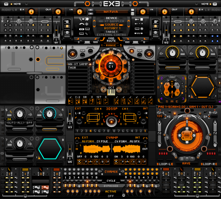
https://we.tl/t-p4ZtHefulb (DEMO, pm for full)
v0.9.8
What's new:
- Top bar slightly redesigned
- general layout slight refined; a bit more space in the "mod section", shorter top bar and slightly shorter synthesis section, should feel more balanced
- FX section generally redesigned
- Mod matrix now goes in two rows (1-6 top row, 7-12 bottom row) instead of columns of two.
- slight visual refinement of some elements.
Unfortunately i couldn't find a way to make metal texture work well for the bottom part that didn't involve complicating everything, so it's been sacrificed for a better FX section.
this took way more time than i thought it would
FX section bypassed:

Separate FX bypassed:

FX knob color follows "knobs" selection.
Custom (Gold) knobs for everything else makes FX knobs color of FX. you can easily rename the "custom" pane to any other to have it display with i.e. white knobs if you prefer color coded knobs.

Burgundy/Gold/Wood looks super classy tho.

v0.9.8
What's new:
- Top bar slightly redesigned
- general layout slight refined; a bit more space in the "mod section", shorter top bar and slightly shorter synthesis section, should feel more balanced
- FX section generally redesigned
- Mod matrix now goes in two rows (1-6 top row, 7-12 bottom row) instead of columns of two.
- slight visual refinement of some elements.
Unfortunately i couldn't find a way to make metal texture work well for the bottom part that didn't involve complicating everything, so it's been sacrificed for a better FX section.
this took way more time than i thought it would
FX section bypassed:
Separate FX bypassed:
FX knob color follows "knobs" selection.
Custom (Gold) knobs for everything else makes FX knobs color of FX. you can easily rename the "custom" pane to any other to have it display with i.e. white knobs if you prefer color coded knobs.
Burgundy/Gold/Wood looks super classy tho.
-
- KVRAF
- 18603 posts since 16 Sep, 2001 from Las Vegas,USA
Thanks, excellent update! I like the new FX section and the Mod Matrix numbering is much more logical now. 
I've settled on this color combination:
I've settled on this color combination:
You do not have the required permissions to view the files attached to this post.
None are so hopelessly enslaved as those who falsely believe they are free. Johann Wolfgang von Goethe
