
Why bother, why not just have these things always visible? Just need the resampler section to be visible always and not tabbed with envelopes.

TAL Sampler
-
Echoes in the Attic Echoes in the Attic https://www.kvraudio.com/forum/memberlist.php?mode=viewprofile&u=180417
- KVRAF
- 11095 posts since 12 May, 2008
-

- KVRist
- 198 posts since 6 Sep, 2016 from Otago, New Zealand
yeah of course, I totally get your opinion on this and it is a shame it's left you feeling like you don't want to use the plugin! As a long-time user I took a bit to adjust and I'm still getting used to how it is now and would maybe suggest a few things could be changed but I want to work with the new layout a bit more before I give my thoughts.
I understand the preference for U-NO-LX in some ways but it's so much more simple in the parameters it needs to present to the user than Sampler is.
I'm curious, not challenging in any way at all, just curious to get some constructive conversation, if you're ok with how Mod looks and works is it more now the tabbed interface specifically that's affected how you feel about using Sampler?
I do think the layout is nice and clear now and that pre-facelift it had grown a bit cluttered as many new features were added since the original release. For those of us used to that it was pretty fine but I could see it being tough for newer users. For the continued popularity I wish for Sampler I think it's an important factor even if it means some workflow adjustment for seasoned users.
Keen to get your thoughts if you have the time.
emptyvessel
Professional sound design for manufacturers and composers
Sound Designer @ Novation.TAL.Arturia.UnfilteredAudio.Kilohearts.PaulHaslinger(composer).Tritik.Xils.AEModular.
https://store.emptyvessel.co.nz/
Professional sound design for manufacturers and composers
Sound Designer @ Novation.TAL.Arturia.UnfilteredAudio.Kilohearts.PaulHaslinger(composer).Tritik.Xils.AEModular.
https://store.emptyvessel.co.nz/
-
Echoes in the Attic Echoes in the Attic https://www.kvraudio.com/forum/memberlist.php?mode=viewprofile&u=180417
- KVRAF
- 11095 posts since 12 May, 2008
If this was meant for me, let me just make it clear that my post above was only referring to making those few controls visible all the time as opposed to a "mini" version with only those controls. Ie. LayerA + Amp ADSR + ReSamplerEmptyVessel wrote: ↑Tue Sep 13, 2022 1:15 am yeah of course, I totally get your opinion on this and it is a shame it's left you feeling like you don't want to use the plugin! As a long-time user I took a bit to adjust and I'm still getting used to how it is now and would maybe suggest a few things could be changed but I want to work with the new layout a bit more before I give my thoughts.
I understand the preference for U-NO-LX in some ways but it's so much more simple in the parameters it needs to present to the user than Sampler is.
I'm curious, not challenging in any way at all, just curious to get some constructive conversation, if you're ok with how Mod looks and works is it more now the tabbed interface specifically that's affected how you feel about using Sampler?
I do think the layout is nice and clear now and that pre-facelift it had grown a bit cluttered as many new features were added since the original release. For those of us used to that it was pretty fine but I could see it being tough for newer users. For the continued popularity I wish for Sampler I think it's an important factor even if it means some workflow adjustment for seasoned users.
Keen to get your thoughts if you have the time.
Currently it isn't possible to have these three things visible at the same time because Resampler and amp ADSR would share a space. So I was only meanign to suggest that instead of creating a whole different version of the plugin, it might be simpler to instead find a way to separate ReSampler section from the envelopes. You asked in the other thread for a suggestion on a better placement. Not sure, but maybe in the effects section? I actually think it might make more sense in the current layout to have the macros share a tab with the envelopes, since macros are modulation in a way, whereas ReSampler is more like an effect. Then you could see the Resampler section at the same time as the main envelope. Plus 4 macro knobs seems more similar to envelope controls, and the ReSampler section has more controls, better for that bigger Effect space, no?
-
- KVRist
- 198 posts since 6 Sep, 2016 from Otago, New Zealand
It wasn'tEchoes in the Attic wrote: ↑Tue Sep 13, 2022 1:27 am If this was meant for me, let me just make it clear that my post above was only referring to making those few controls visible all the time as opposed to a "mini" version with only those controls. Ie. LayerA + Amp ADSR + ReSampler
Currently it isn't possible to have these three things visible at the same time because Resampler and amp ADSR would share a space. So I was only meanign to suggest that instead of creating a whole different version of the plugin, it might be simpler to instead find a way to separate ReSampler section from the envelopes. You asked in the other thread for a suggestion on a better placement. Not sure, but maybe in the effects section? I actually think it might make more sense in the current layout to have the macros share a tab with the envelopes, since macros are modulation in a way, whereas ReSampler is more like an effect. Then you could see the Resampler section at the same time as the main envelope. Plus 4 macro knobs seems more similar to envelope controls, and the ReSampler section has more controls, better for that bigger Effect space, no?
I wondered if the FX area might be a better fit for the resampler also. That "control" macro section seems a better fit with the envelopes logically and then the resampler by default will be the visible tab in the fx area. Appreciate your thoughts, I'm just collecting a few points and passing that on to Patrick.
emptyvessel
Professional sound design for manufacturers and composers
Sound Designer @ Novation.TAL.Arturia.UnfilteredAudio.Kilohearts.PaulHaslinger(composer).Tritik.Xils.AEModular.
https://store.emptyvessel.co.nz/
Professional sound design for manufacturers and composers
Sound Designer @ Novation.TAL.Arturia.UnfilteredAudio.Kilohearts.PaulHaslinger(composer).Tritik.Xils.AEModular.
https://store.emptyvessel.co.nz/
-
midi_transmission midi_transmission https://www.kvraudio.com/forum/memberlist.php?mode=viewprofile&u=298730
- KVRian
- 989 posts since 13 Feb, 2013
emptyvessel, much appriciated that you care.  many point have been mentioned before. what is a good ui.
- a good ui that makes me click as less as possible
- and that tells me as fast as possible what's going on
both points are much worse now.
minimalism is reducing as much as possible, without taking away too much. for me it feels exactly like that someone is overstretching this thought, while thinking to do something good with it.
-> Window size and parameters: now we have a too small window size, therefore scrolling in the modulation area and too many tabs. the scrollable modulation section is super annoying.
compare the old versions, doesn't take much more space, but you have instant overview about all parameters at once, much less mouse clicks because you don't need to switch so many tabs like now
viewtopic.php?p=8509624#p8509624
-> Color coding of section: I think the color coding of sections (LFO+env, fx) was helpful in the past, but that's not super important. many of the preset themes like the green one makes me wonder if anyone really thinks about using them. I think the impression from some people to be overwhelmed comes from making everything uniform and monochrome so to say.
-> Bad usage of space: now you have a bad space distribution of elements with random placement, not using a ui grid or anything. there is a lot of empty space without any benefit. you can almost fit both ENV sections in one of the current tabs for example!
everything is forced in tabs but you have a big empty section with the TAL sampler logo, that almost make tabs for FX superfluous when you would use this space for controls.
-> Two window sizes? maybe make two window sizes when you really need to have a smaller window and a bigger one like in the past? or make sections expandable and when they are hidden, you can still access them via tab.
-> Value indication hover above knobs is bad: I hate, yes strong word but true, the new way to show the current value when you hover the knob. this is the worst pattern even when some big players use it too. everything is moving all the time. the central place to show the current value is much better or to always show it.
-> Browser: browsing presets in the new browser is very time consuming and frustrating now when you have many subfolders like in the factory presets. so much mouse clicks to browse through your presets when you try to get an overview. this was much easier before, I don't say that the solution was better, but the current browser is very much lacking a good experience. you need something like a flat folder view, where the folder is shown as a second column and all presets in a long list. or a small folder tree in addition.
-> Keyboard: I liked the keyboard, but I don't have strong feelings that it's removed.
-> The current ui lacks the hands on approach, it's like a digital sampler with menu diving compared to an analog synth with everything at hands. for me it feels similar to what I dislike about kontakt now.
for me it feels like someone thought just conceptional about a ui without thinking about actually solving a task with it.
-
- KVRist
- 269 posts since 5 Sep, 2011
Well summarizedmidi_transmission wrote: ↑Tue Sep 13, 2022 6:59 pm emptyvessel, much appriciated that you care.
- a good ui that makes me click as less as possible
- and that tells me as fast as possible what's going on
both points are much worse now.
minimalism is reducing as much as possible, without taking away too much. for me it feels exactly like that someone is overstretching this thought, while thinking to do something good with it.
-> Window size and parameters: now we have a too small window size, therefore scrolling in the modulation area and too many tabs. the scrollable modulation section is super annoying.
compare the old versions, doesn't take much more space, but you have instant overview about all parameters at once, much less mouse clicks because you don't need to switch so many tabs like now
viewtopic.php?p=8509624#p8509624
-> Color coding of section: I think the color coding of sections (LFO+env, fx) was helpful in the past, but that's not super important. many of the preset themes like the green one makes me wonder if anyone really thinks about using them. I think the impression from some people to be overwhelmed comes from making everything uniform and monochrome so to say.
-> Bad usage of space: now you have a bad space distribution of elements with random placement, not using a ui grid or anything. there is a lot of empty space without any benefit. you can almost fit both ENV sections in one of the current tabs for example!
everything is forced in tabs but you have a big empty section with the TAL sampler logo, that almost make tabs for FX superfluous when you would use this space for controls.
-> Two window sizes? maybe make two window sizes when you really need to have a smaller window and a bigger one like in the past? or make sections expandable and when they are hidden, you can still access them via tab.
-> Value indication hover above knobs is bad: I hate, yes strong word but true, the new way to show the current value when you hover the knob. this is the worst pattern even when some big players use it too. everything is moving all the time. the central place to show the current value is much better or to always show it.
-> Browser: browsing presets in the new browser is very time consuming and frustrating now when you have many subfolders like in the factory presets. so much mouse clicks to browse through your presets when you try to get an overview. this was much easier before, I don't say that the solution was better, but the current browser is very much lacking a good experience. you need something like a flat folder view, where the folder is shown as a second column and all presets in a long list. or a small folder tree in addition.
-> Keyboard: I liked the keyboard, but I don't have strong feelings that it's removed.
-> The current ui lacks the hands on approach, it's like a digital sampler with menu diving compared to an analog synth with everything at hands. for me it feels similar to what I dislike about kontakt now.
for me it feels like someone thought just conceptional about a ui without thinking about actually solving a task with it.
Specially this:
We had a Juno 106/60 type of sampler experience, but now we have a Alpha Juno without the controller sampler experience-> The current ui lacks the hands on approach, it's like a digital sampler with menu diving compared to an analog synth with everything at hands. for me it feels similar to what I dislike about kontakt now.
-
abstractdolphin abstractdolphin https://www.kvraudio.com/forum/memberlist.php?mode=viewprofile&u=462345
- KVRer
- 10 posts since 14 Apr, 2020
Can you please pass on that the ability to attach effects to individual layers (as can be done with the filters) would be of massive use to people like me. When layering different samples having all of them be affected by the same effects is a real limitation on how complex they can be.EmptyVessel wrote: ↑Tue Sep 13, 2022 1:45 amIt wasn'tEchoes in the Attic wrote: ↑Tue Sep 13, 2022 1:27 am If this was meant for me, let me just make it clear that my post above was only referring to making those few controls visible all the time as opposed to a "mini" version with only those controls. Ie. LayerA + Amp ADSR + ReSampler
Currently it isn't possible to have these three things visible at the same time because Resampler and amp ADSR would share a space. So I was only meanign to suggest that instead of creating a whole different version of the plugin, it might be simpler to instead find a way to separate ReSampler section from the envelopes. You asked in the other thread for a suggestion on a better placement. Not sure, but maybe in the effects section? I actually think it might make more sense in the current layout to have the macros share a tab with the envelopes, since macros are modulation in a way, whereas ReSampler is more like an effect. Then you could see the Resampler section at the same time as the main envelope. Plus 4 macro knobs seems more similar to envelope controls, and the ReSampler section has more controls, better for that bigger Effect space, no?You sneaked a reply in while I was typing the response to @midi_transmission
I wondered if the FX area might be a better fit for the resampler also. That "control" macro section seems a better fit with the envelopes logically and then the resampler by default will be the visible tab in the fx area. Appreciate your thoughts, I'm just collecting a few points and passing that on to Patrick.
-
- KVRist
- 198 posts since 6 Sep, 2016 from Otago, New Zealand
The filters within each layer are vastly simpler (in terms of modelling/CPU use) than the main filter options. With all of the modelled/emulated circuitry in Sampler it is relatively high CPU use which is why there's very little per layer specific functionality. I would imagine putting FX in each layer would be too demanding but yeah of course I can pass that on. Anyone can also email TAL themselves, there's an address on the website.Can you please pass on that the ability to attach effects to individual layers (as can be done with the filters) would be of massive use to people like me. When layering different samples having all of them be affected by the same effects is a real limitation on how complex they can be.
Perhaps some routing options though where it's possible to route the audio from a layer through the fx or directly to the out? Or a per layer fx send? Honestly I quite like how relatively simple TAL Sampler is, it was never the intention to remake Kontakt or anywhere close, but to give the experience and sound of working with a vintage sampler. Embrace the simplicity, enjoy the challenges!!
I get what you're saying 100%, I just use TAL Sampler for what it's great at and if I want more complexity I'll switch to Falcon.
emptyvessel
Professional sound design for manufacturers and composers
Sound Designer @ Novation.TAL.Arturia.UnfilteredAudio.Kilohearts.PaulHaslinger(composer).Tritik.Xils.AEModular.
https://store.emptyvessel.co.nz/
Professional sound design for manufacturers and composers
Sound Designer @ Novation.TAL.Arturia.UnfilteredAudio.Kilohearts.PaulHaslinger(composer).Tritik.Xils.AEModular.
https://store.emptyvessel.co.nz/
-
- KVRist
- 198 posts since 6 Sep, 2016 from Otago, New Zealand
Heads up the new update is out although not officially announced.
Re-sampler is now visible by default in a new location.
https://tal-software.com/products/tal-sampler
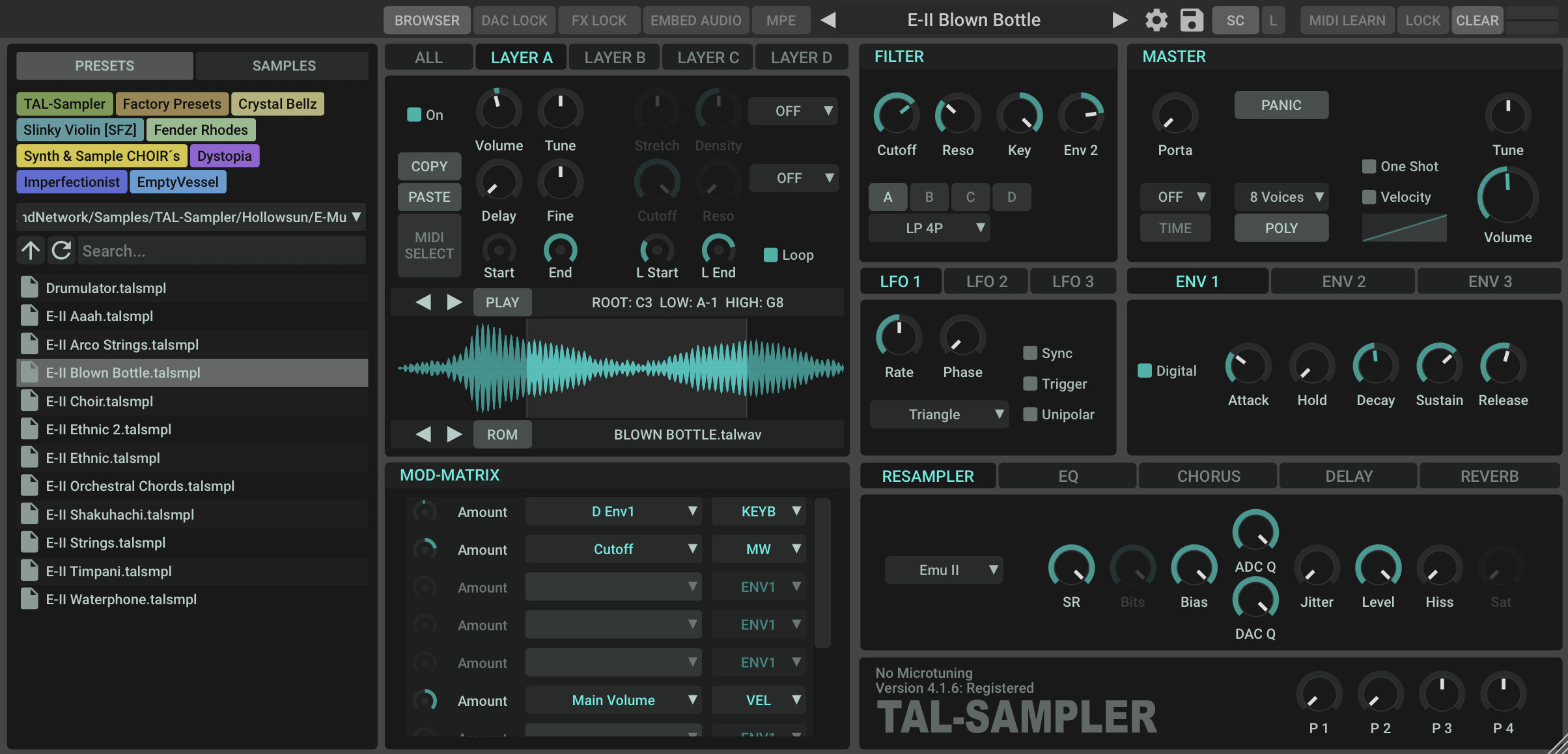
Re-sampler is now visible by default in a new location.
https://tal-software.com/products/tal-sampler
emptyvessel
Professional sound design for manufacturers and composers
Sound Designer @ Novation.TAL.Arturia.UnfilteredAudio.Kilohearts.PaulHaslinger(composer).Tritik.Xils.AEModular.
https://store.emptyvessel.co.nz/
Professional sound design for manufacturers and composers
Sound Designer @ Novation.TAL.Arturia.UnfilteredAudio.Kilohearts.PaulHaslinger(composer).Tritik.Xils.AEModular.
https://store.emptyvessel.co.nz/
-

- KVRAF
- 3842 posts since 15 Mar, 2002 from Underworld
Talking of layout, P1 P2 P3 P4 should be left, not right from the TAL-Sampler logo. That's pretty obvious. 
Still, not having at least VCA and VCF envelopes visible at all times... these two are some of the most used knobs and not being able to see them both at once is a no-no.
Useless non-retractable keyboard is excellent riddance. Having FX visible all the time is also great riddance, because FX are usually set and forget. However, having a global "turn off FX" button would be smashing! 
Speaking of space, Sampler could be a bit taller, so all the envelopes could fit in where just ENV1 is now, just like in v3. Also, that would make space for all the modulations so we wouldn't have to scroll. That would also make all three LFOs accessible, too, if he puts them all three vertically. Then put the envelopes left of LFOs... because, you know - they're more important. I have a great eye for space, colour and usability btw. I should design GUIs.
Still, aside from the GUI problems... I'm more bothered with the lack of separate outputs at least for the layers. I was so hoping that would be in a major version update [which this didn't turn out to be at all].
Still, not having at least VCA and VCF envelopes visible at all times... these two are some of the most used knobs and not being able to see them both at once is a no-no.
Useless non-retractable keyboard is excellent riddance.
Speaking of space, Sampler could be a bit taller, so all the envelopes could fit in where just ENV1 is now, just like in v3. Also, that would make space for all the modulations so we wouldn't have to scroll.
Still, aside from the GUI problems... I'm more bothered with the lack of separate outputs at least for the layers. I was so hoping that would be in a major version update [which this didn't turn out to be at all].
It is no measure of health to be well adjusted to a profoundly sick society. - Jiddu Krishnamurti
-
midi_transmission midi_transmission https://www.kvraudio.com/forum/memberlist.php?mode=viewprofile&u=298730
- KVRian
- 989 posts since 13 Feb, 2013
A bit better, but the major problems are not resolved. Hope this is just the beginningEmptyVessel wrote: ↑Thu Sep 15, 2022 11:13 pm Heads up the new update is out although not officially announced.
Re-sampler is now visible by default in a new location.
https://tal-software.com/products/tal-sampler
-
midi_transmission midi_transmission https://www.kvraudio.com/forum/memberlist.php?mode=viewprofile&u=298730
- KVRian
- 989 posts since 13 Feb, 2013
I had the same thought. Good description, I knew what you mean at once.
You would get space as well because the big tab bar is not needed any more, I guess.
-
Jonathan Shepherd Jonathan Shepherd https://www.kvraudio.com/forum/memberlist.php?mode=viewprofile&u=5644
- KVRian
- 646 posts since 28 Jan, 2003
I can't access the TAL website; whether it's the main page or any product pages, all I get is a black screen with the TAL header at the top and nothing else. When I try to log in, nothing. I switched to desktop view(I'm on android) and nothing still. It's been this way for days now. Anyone else had this problem? I'll wait to contact Tal, as it may be a simple solution that one of you guys points out to me. Here's a screenshot:
You do not have the required permissions to view the files attached to this post.
-
Jonathan Shepherd Jonathan Shepherd https://www.kvraudio.com/forum/memberlist.php?mode=viewprofile&u=5644
- KVRian
- 646 posts since 28 Jan, 2003
No, both cookies and JavaScript is on.And I've tried to access the site through both Chrome and Opera, on 2 android phones, but no dice. Strange.
