Melda GUI improvements
- KVRian
- 719 posts since 23 May, 2010
https://spektralisk.com/products | Sound libraries for: Massive X, Pigments, Vital, Razor, Kontour and more | Free sounds → Sound Flux
-
- KVRist
- Topic Starter
- 192 posts since 23 Apr, 2006
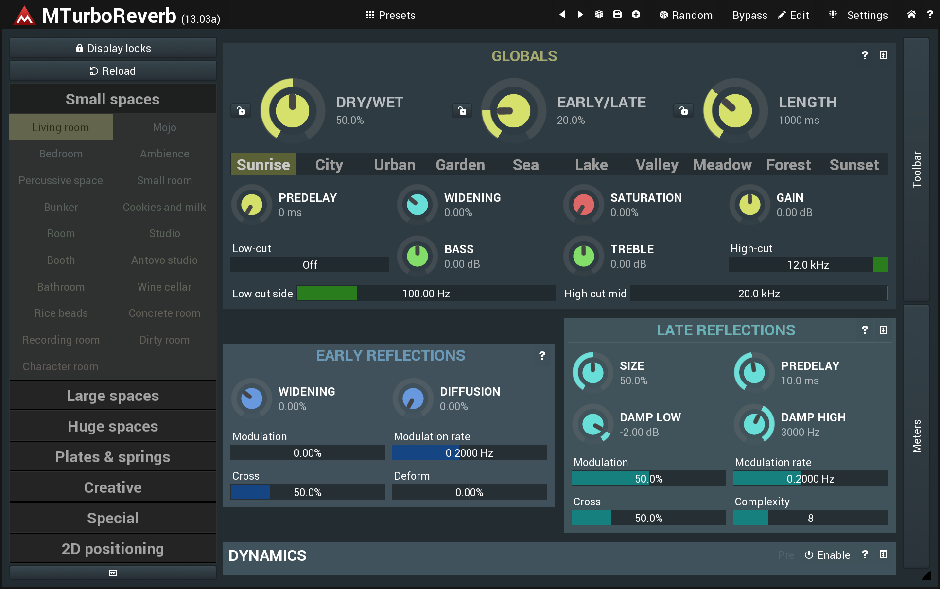
The main thing about that which is objectively less good than the others, is that the bright green is present on all knobs, whether they're used or not. It reduces the at-a-glance utility of 'bright green = knob in use' which is present in the other designs most people prefer.
-
prodigal_sounds prodigal_sounds https://www.kvraudio.com/forum/memberlist.php?mode=viewprofile&u=176348
- KVRist
- 81 posts since 17 Mar, 2008
- KVRian
- 603 posts since 14 Mar, 2006
I agree 100%.prodigal_sounds wrote: ↑Sun Jun 30, 2019 12:13 am+1 for Right.
those knobs are really, really good and I want them.
“Sometimes you have to play a long time to be able to play like yourself.” -Miles Davis
- KVRist
- 238 posts since 18 Mar, 2007 from London
+1 for Right, in my opinion those are great. I would be 100% satisfied working with those.prodigal_sounds wrote: ↑Sun Jun 30, 2019 12:13 am+1 for Right.
I've followed this thread without comment until now - those knobs are really, really good and I want them.
Also, I really like these new melda beta 13.03 version knobs (see for example this video:
https://www.youtube.com/watch?v=YZ3uud0gPNs), those are also knobs that I consider to be functional and at the same time aesthetically pleasing.
I agree with a lot of the previous modification suggestions though (see pics below), here are my 2 cents:

1. I prefer lower-text case for everything apart from headings/module names (Someone mentioned in this thread that one can already select this option in preferences, I need to double check that).
2. I think the outer ring should be slightly thinner.
3. In my opinion the module name text should be centered.
4. Perhaps the module name text should be colored the same as the buttons/knobs of the same module (as on the above pic), though it needs a very careful buttons/knobs color selection, because the same colored text must be easily readable on the given background. The readability of the text is more important than this "colored module name text idea", so even though this idea sounds great on paper, perhaps it creates more problems than it solves. Looking at the above pic's color scheme (that I like a lot) I'm not 100% convinced, I think some of the readability of the module name is lost because of this coloring. Someone with more design experience should decide about the actual color sets that could work or decide that this idea should be dropped because of the readability issue.
5. I find the colored preset names very distracting, I think those should be muted and uni-colored (something like the above pic's preset section) .
6. "locator" pointing to current value should be added to the knobs, this I think is essential.
Finally I have to say that I really like this aesthetic direction, in my opinion it's much better than any previous Melda look. Great work, thanks Vojtech and everyone else involved.
-
- KVRAF
- 10309 posts since 2 Sep, 2003 from Surrey, UK
1 Try it - in the main Setting > Style configuration window.
2 Could be done, in the Style Editor (and with a graphics editor).
3 What about modules with buttons in the title bar?
4 Cannot be done currently; and you have identified the problem - title bars can be coloured and nor necessarily the same as the Highlights colour. That's why I made them italics and made the line separator more distinct.
5 Hard-coded - the colours were originally significant, but I cannot recall whether that it still the case.
6 Your mock-up shows the locators doesn't it?
- KVRist
- 250 posts since 21 Jun, 2018
+1ozonepaul wrote: ↑Mon Jul 01, 2019 8:08 am+1 for Right, in my opinion those are great. I would be 100% satisfied working with those.prodigal_sounds wrote: ↑Sun Jun 30, 2019 12:13 am+1 for Right.
I've followed this thread without comment until now - those knobs are really, really good and I want them.
Also, I really like these new melda beta 13.03 version knobs (see for example this video:
https://www.youtube.com/watch?v=YZ3uud0gPNs), those are also knobs that I consider to be functional and at the same time aesthetically pleasing.
I agree with a lot of the previous modification suggestions though (see pics below), here are my 2 cents:
1. I prefer lower-text case for everything apart from headings/module names (Someone mentioned in this thread that one can already select this option in preferences, I need to double check that).
2. I think the outer ring should be slightly thinner.
3. In my opinion the module name text should be centered.
4. Perhaps the module name text should be colored the same as the buttons/knobs of the same module (as on the above pic), though it needs a very careful buttons/knobs color selection, because the same colored text must be easily readable on the given background. The readability of the text is more important than this "colored module name text idea", so even though this idea sounds great on paper, perhaps it creates more problems than it solves. Looking at the above pic's color scheme (that I like a lot) I'm not 100% convinced, I think some of the readability of the module name is lost because of this coloring. Someone with more design experience should decide about the actual color sets that could work or decide that this idea should be dropped because of the readability issue.
5. I find the colored preset names very distracting, I think those should be muted and uni-colored (something like the above pic's preset section) .
6. "locator" pointing to current value should be added to the knobs, this I think is essential.
Finally I have to say that I really like this aesthetic direction, in my opinion it's much better than any previous Melda look. Great work, thanks Vojtech and everyone else involved.
-
- KVRAF
- 10309 posts since 2 Sep, 2003 from Surrey, UK
- KVRist
- 250 posts since 21 Jun, 2018
- KVRian
- 603 posts since 14 Mar, 2006
-
- KVRist
- 307 posts since 11 Jul, 2016
-
Chandlerhimself Chandlerhimself https://www.kvraudio.com/forum/memberlist.php?mode=viewprofile&u=318799
- KVRAF
- 1700 posts since 19 Dec, 2013 from Japan
-
- KVRAF
- 5804 posts since 27 Jul, 2001 from Tarpon Springs, Florida, USA
For multi-touch user like myself I would like to see some indication that I am touching the knob.
Perhaps something on the perimeter changes. The center may be covered by the finger?
Most of the time I Prefer vertical action like on a mixer.
Perhaps something on the perimeter changes. The center may be covered by the finger?
Most of the time I Prefer vertical action like on a mixer.
My Studio: viewtopic.php?f=4&t=7760&p=7777146#p7777146


