
Like it? Hate it? Don't care either way? Let us know.
Link: https://www.musicradar.com/news/ni-mass ... lease-date

Massive X GUI Poll
-

- KVRAF
- Topic Starter
- 21196 posts since 8 Oct, 2014
Last edited by wagtunes on Mon Mar 18, 2019 10:07 am, edited 1 time in total.
-
- KVRAF
- 2675 posts since 14 Jul, 2005 from Australia
I find it way too bright, not a fan, which is a bummer because Massive 1.x is one of my most essential synths for production. Massive 1.x had a nice combination of light and dark, seemed like a better balance to me.
-

- KVRist
- 455 posts since 13 Mar, 2018
Link to see it?
EDIT: I don't know why I ask, I don't care. I guess I'm just bored.
EDIT: I don't know why I ask, I don't care. I guess I'm just bored.
MAN FROM SPACE
Spotify: https://open.spotify.com/artist/135uz9UwHtdXZgiFyAc3oz
SoundCloud: https://soundcloud.com/manfromspace
GumRoad (FREE Ableton racks and synth presets): https://gumroad.com/manfromspace
Spotify: https://open.spotify.com/artist/135uz9UwHtdXZgiFyAc3oz
SoundCloud: https://soundcloud.com/manfromspace
GumRoad (FREE Ableton racks and synth presets): https://gumroad.com/manfromspace
-
- KVRAF
- 7755 posts since 15 Sep, 2005 from East Coast of the USA
-
- KVRAF
- 2418 posts since 9 Nov, 2016
For me it's not a question of like or hate but of good elements versus not so good elements.
* I like the graphical layer (the way knobs etc look)
* Contrast is low though
* It reminds me of Reaktor blocks in a bad way. Blocks was even more of a mess but that might reflect the real life situation of modular, having modules from different brands mixed together.
I consider Massive X as one synth though, so I'd like more consistency throughout the GUI. Some consistency in the alignment of knobs across the synth and whether to use a black versus grey knob would really not be too much to ask.
-
- KVRAF
- Topic Starter
- 21196 posts since 8 Oct, 2014
All this aside, you either like what they did with the GUI or you don't. It's not a hard question to answer. Sounds to me like you don't like what they did.Stefken wrote: ↑Mon Mar 18, 2019 11:14 am For me it's not a question of like or hate but of good elements versus not so good elements.
* I like the graphical layer (the way knobs etc look)
* Contrast is low though
* It reminds me of Reaktor blocks in a bad way. Blocks was even more of a mess but that might reflect the real life situation of modular, having modules from different brands mixed together.
I consider Massive X as one synth though, so I'd like more consistency throughout the GUI. Some consistency in the alignment of knobs across the synth and whether to use a black versus grey knob would really not be too much to ask.
-

- KVRAF
- 18563 posts since 16 Sep, 2001 from Las Vegas,USA
It's possible to like some of the elements and not others. For example I find there to be way too many colors in use for my taste. Looks like a box of crayons exploded. I find a lot of different colors visually distracting.
Other than that the knobs, background etc seem fine but the light skin would be tiring to my eyes so a darker option would be welcome here. (but why is the LFO selector so large ?)
I've demoed Massive several times but never purchased it so the question is would this skin keep from buying it or make me want it the second it's released ? No to both.
So I guess I'm ambivalent. I neither love it or hate it. I think it would be perfectly functional in every day use but if I had a magic wand I would probably conjure up something more pleasing to my personal taste. So since there are no other options I guess I'd have to vote "don't care".
None are so hopelessly enslaved as those who falsely believe they are free. Johann Wolfgang von Goethe
-
- KVRAF
- 2313 posts since 20 Oct, 2014
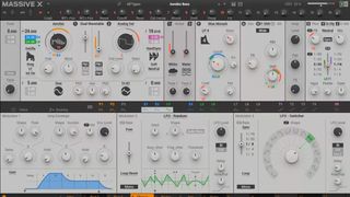
Of course I like it, it is a really nice design. I only hope design follows functionality, not the opposite. Not sure about that HUUUUGE LFO switcher knob, it looks good, but is that spacewaste any useful? Also no value displays. I don't like one huge display all the time, why not mouse following popup instead?
-
- KVRist
- 459 posts since 5 Jan, 2004 from In the now
I dislike that it doesn't look like a musical instrument. But I do like that it doesn't look like a musical instrument but rather a control panel for a power plant or something. 
"If less is more, just think of how much more, more will be".
-
- KVRian
- 1288 posts since 25 Jul, 2009
Massive X
Blocks
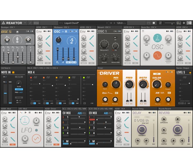
Looks like Blocks in Monochrome to me.
Blocks has more color, contrast, variety, and I think it'd be easier on the eyes if you'd be using it for long periods of time.
Blocks
Looks like Blocks in Monochrome to me.
Blocks has more color, contrast, variety, and I think it'd be easier on the eyes if you'd be using it for long periods of time.
-
- KVRAF
- 2313 posts since 20 Oct, 2014
For me blocks looks like a toy, a random design mess.
-

- KVRAF
- 23102 posts since 7 Jan, 2009 from Croatia
-

- Banned
- 2288 posts since 24 Mar, 2015 from Toronto, Canada
I votes yes because the old one is really showing it's age and because there is no choice in the matter. I would just like to have it.
But what could be really cool is if NI allowed themes. So you could load the old Massive theme for the users that have been using the old one for a very long time and are accustomed to the old look. That way it allows easier Transition to the new version. Don't know how doable or probable that is, but it would be cool.
But what could be really cool is if NI allowed themes. So you could load the old Massive theme for the users that have been using the old one for a very long time and are accustomed to the old look. That way it allows easier Transition to the new version. Don't know how doable or probable that is, but it would be cool.
 Spotify
  Soundcloud
  Soundclick
Gear & Setup: Windows 10, Dual Xeon, 32GB RAM, Cubase 10.5/9.5, NI Komplete Audio 6, NI Maschine, NI Jam, NI Kontakt
-
- KVRAF
- 18563 posts since 16 Sep, 2001 from Las Vegas,USA
Ahhh I see. Can you make a screenshot of the other modules please ? At first glance it just seems like that particular LFO module takes up more space than needed.EvilDragon wrote: ↑Mon Mar 18, 2019 12:28 pmBecause modulator modules have fixed size in order to be interchangeable and always shown as 3 per tab. Each of the 9 modulators can be an envelope or an LFO (except one which is fixed as amp envelope always).
Oh and I assume the GUI is resizable ?
Last edited by Teksonik on Mon Mar 18, 2019 12:49 pm, edited 1 time in total.
None are so hopelessly enslaved as those who falsely believe they are free. Johann Wolfgang von Goethe

