
correct, not all expansions have arp presets.

Vengeance Producer Suite - AVENGER - 1.8.5 the main thread

-
- KVRian
- 1057 posts since 18 Dec, 2007
Cheers
Some of the presets in the expansions I couldn't press one key without my cpu going crazy and the sound cutting out. Thats a single key using a 2013 mac pro 3.6 6-core, absolute madness
-

- KVRian
- 528 posts since 19 Feb, 2013
Dang, yeah not sure why that would be. On my PC I typically run my buffer at 512. I have run at lower settings without problems, but I don't really feel I have a need for it to be that quick.m-ac wrote: ↑Thu Jan 16, 2020 9:28 am Some of the presets in the expansions I couldn't press one key without my cpu going crazy and the sound cutting out. Thats a single key using a 2013 mac pro 3.6 6-core, absolute madnessI've increased my buffer from 128 to 256 when using avenger for the time being. Hopefully the mac version will get some performance tweaks in future updates.
-
- KVRian
- 528 posts since 19 Feb, 2013
I also figured out how to automate Avenger's pitch in FL Studio (a little less complicated than I thought). I was trying to figure out how to automate the pitch wheel in Avenger - which I don't think is possible. But this is how you do it; crank up the pitch range to the max (48), then automate the wrapper's pitch knob.

-
- KVRist
- 113 posts since 6 Nov, 2014
I don't know, there's a lot of stuff that would go beyond UX/UI designers' comprehension.
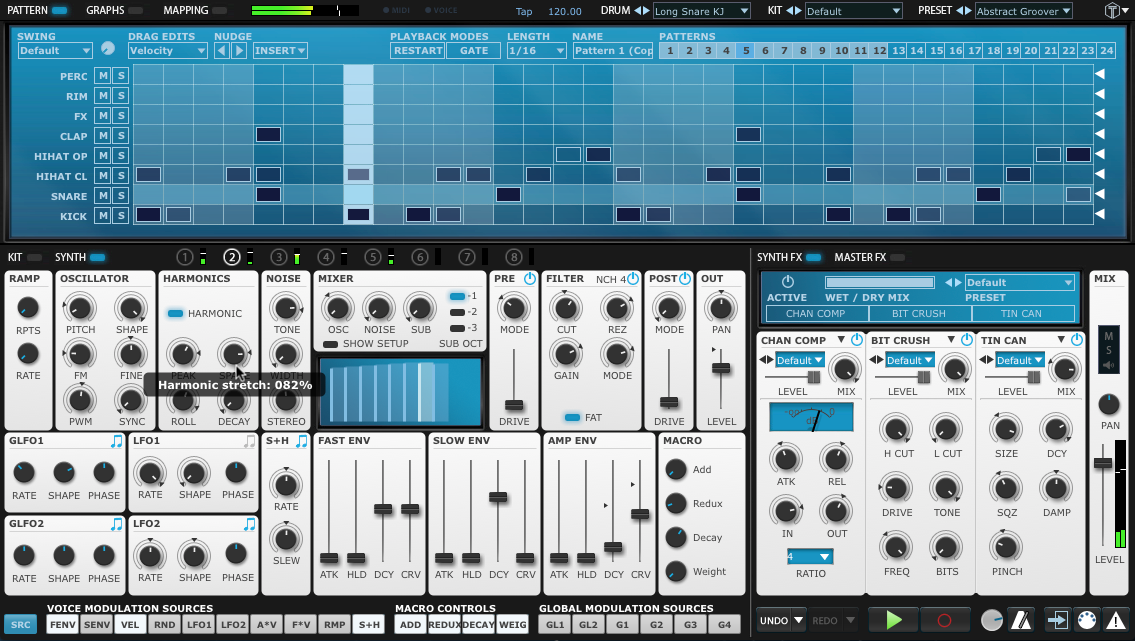
Same reason why text is displayed above knobs and not below like the vast majority of hardware and software instruments (for a very good reason, too). It doesn't look good and it objectively wastes more space, but we can sit here all day and argue about any GUI/UI/UX improvement and they would just be words in an ear and out of the other. Same thing with the font, and it doesn't happen that among Avenger's userbase there are a lot of people who, for some reason, don't want to let people engage in respectful criticism with all due argumentations, just so devs don't get triggered and leave this place. Oh, nevermind, he did (Rene hasn't really been here at all, and he's the one doing the coding, go figure).
When Manuel said they would have implemented the original white theme I was very excited, but when it actually happened I bursted in laughter andI wondered if it was even worth the trouble and the time to deliver something so sub par, compared to the original.
Going from this

to this

is a quite embarassing
thumbnails are already looking bad, open the images to cry
-
- KVRian
- 1057 posts since 18 Dec, 2007
I actually designed the top example, so thanks!tapekiller wrote: ↑Fri Jan 17, 2020 3:38 pmI don't know, there's a lot of stuff that would go beyond UX/UI designers' comprehension.
Same reason why text is displayed above knobs and not below like the vast majority of hardware and software instruments (for a very good reason, too). It doesn't look good and it objectively wastes more space, but we can sit here all day and argue about any GUI/UI/UX improvement and they would just be words in an ear and out of the other. Same thing with the font, and it doesn't happen that among Avenger's userbase there are a lot of people who, for some reason, don't want to let people engage in respectful criticism with all due argumentations, just so devs don't get triggered and leave this place. Oh, nevermind, he did (Rene hasn't really been here at all, and he's the one doing the coding, go figure).
When Manuel said they would have implemented the original white theme I was very excited, but when it actually happened I bursted in laughter andI wondered if it was even worth the trouble and the time to deliver something so sub par, compared to the original.
Going from this
to this
is a quite embarassing
thumbnails are already looking bad, open the images to cry
-

- KVRAF
- 13196 posts since 16 Feb, 2005 from Kingston, Jamaica
ooooh..... I thought the white skin was satya's design.
I see....
no further comments
Beyond I much prefer the top image.
rsp
sound sculptist
-

- KVRist
- 179 posts since 14 Jul, 2019
I prefer the font of the lower image. My poor vision appreciates the bold. I could work with either layout.tapekiller wrote: ↑Fri Jan 17, 2020 3:38 pmI don't know, there's a lot of stuff that would go beyond UX/UI designers' comprehension.
Same reason why text is displayed above knobs and not below like the vast majority of hardware and software instruments (for a very good reason, too). It doesn't look good and it objectively wastes more space, but we can sit here all day and argue about any GUI/UI/UX improvement and they would just be words in an ear and out of the other. Same thing with the font, and it doesn't happen that among Avenger's userbase there are a lot of people who, for some reason, don't want to let people engage in respectful criticism with all due argumentations, just so devs don't get triggered and leave this place. Oh, nevermind, he did (Rene hasn't really been here at all, and he's the one doing the coding, go figure).
When Manuel said they would have implemented the original white theme I was very excited, but when it actually happened I bursted in laughter andI wondered if it was even worth the trouble and the time to deliver something so sub par, compared to the original.
Going from this
to this
is a quite embarassing
thumbnails are already looking bad, open the images to cry
-
- KVRer
- 25 posts since 12 Oct, 2018
where/how to get the beautiful "original white theme"?
Cubase Pro 10.5.12 @ Windows 10 Home v1909 @ i9-9900K 32GB @ Gigabyte Z370 HD3P
https://www.youtube.com/channel/UCcLk3l ... gPCNegk5gw
https://soundcloud.com/dj-mce-1
https://www.youtube.com/channel/UCcLk3l ... gPCNegk5gw
https://soundcloud.com/dj-mce-1
-
- KVRist
- 113 posts since 6 Nov, 2014
That's amazing. And it also makes sense that they weren't the ones that came up with it, because what eventually became avenger looks like a web flash game manu from the 00s (especially the browser animations, why are they even therem-ac wrote: ↑Fri Jan 17, 2020 4:36 pmI actually designed the top example, so thanks!tapekiller wrote: ↑Fri Jan 17, 2020 3:38 pmI don't know, there's a lot of stuff that would go beyond UX/UI designers' comprehension.
Same reason why text is displayed above knobs and not below like the vast majority of hardware and software instruments (for a very good reason, too). It doesn't look good and it objectively wastes more space, but we can sit here all day and argue about any GUI/UI/UX improvement and they would just be words in an ear and out of the other. Same thing with the font, and it doesn't happen that among Avenger's userbase there are a lot of people who, for some reason, don't want to let people engage in respectful criticism with all due argumentations, just so devs don't get triggered and leave this place. Oh, nevermind, he did (Rene hasn't really been here at all, and he's the one doing the coding, go figure).
When Manuel said they would have implemented the original white theme I was very excited, but when it actually happened I bursted in laughter andI wondered if it was even worth the trouble and the time to deliver something so sub par, compared to the original.
Going from this
to this
is a quite embarassing
thumbnails are already looking bad, open the images to cry
Anyway, where can I find more of your works?
I think Satya had just to adapt the original skin concept to the current layout. Can't really blame him if it didn't turn out well, because it's what he had to work with and sadly there is no way around many elements that could use improvement (which you can do in u-he plugins, you can change literally everything, even layout).
-
- KVRian
- 1057 posts since 18 Dec, 2007
I don't know what was involved with actually getting the design into avenger, so there are likely very good reasons they had to alter the designs. If you could see some of the UX design and ideas I created...lets just say I probably gave Rene some sleepless nightstapekiller wrote: ↑Wed Jan 22, 2020 9:45 am That's amazing. And it also makes sense that they weren't the ones that came up with it, because what eventually became avenger looks like a web flash game manu from the 00s (especially the browser animations, why are they even there
Anyway, where can I find more of your works?
Other works? Hmmm, I designed Tremor with fxpansion. That was a little easier in a lot of ways as it was designed from scratch. It's a pity it was discontinued, an awesome bit of software https://www.fxpansion.com/products/tremor/
-
- KVRist
- 113 posts since 6 Nov, 2014
I see. Some things (like text above knobs rather than below) could definitely have been kept the way they were since I don't really see the need to change them from a programming standpoint, on the other hand there are some other things (maybe like "module" width which is more functional now) maybe were changed to make everything sit better on the code coming from phalanx. I would love to see the discarded UX ideas as well lol.m-ac wrote: ↑Wed Jan 22, 2020 11:35 amI don't know what was involved with actually getting the design into avenger, so there are likely very good reasons they had to alter the designs. If you could see some of the UX design and ideas I created...lets just say I probably gave Rene some sleepless nightstapekiller wrote: ↑Wed Jan 22, 2020 9:45 am That's amazing. And it also makes sense that they weren't the ones that came up with it, because what eventually became avenger looks like a web flash game manu from the 00s (especially the browser animations, why are they even there
Anyway, where can I find more of your works?
Other works? Hmmm, I designed Tremor with fxpansion. That was a little easier in a lot of ways as it was designed from scratch. It's a pity it was discontinued, an awesome bit of software https://www.fxpansion.com/products/tremor/
Despite being quite busy, Tremor's interface is still very legible and not all over the place, so kudos for that. Maybe very faint colour coding could have helped but it's not that important once you get used to what you're working with. Font is also good, and yet again proves that cleaner typefaces are more legible than bold ones
-
- KVRian
- 1057 posts since 18 Dec, 2007
Cheers. Yeah, again there had to be some changes in Tremor too. I guess it's that constant balance between available development time, ux, and aesthetics.tapekiller wrote: ↑Wed Jan 22, 2020 1:37 pmI see. Some things (like text above knobs rather than below) could definitely have been kept the way they were since I don't really see the need to change them from a programming standpoint, on the other hand there are some other things (maybe like "module" width which is more functional now) maybe were changed to make everything sit better on the code coming from phalanx. I would love to see the discarded UX ideas as well lol.m-ac wrote: ↑Wed Jan 22, 2020 11:35 amI don't know what was involved with actually getting the design into avenger, so there are likely very good reasons they had to alter the designs. If you could see some of the UX design and ideas I created...lets just say I probably gave Rene some sleepless nightstapekiller wrote: ↑Wed Jan 22, 2020 9:45 am That's amazing. And it also makes sense that they weren't the ones that came up with it, because what eventually became avenger looks like a web flash game manu from the 00s (especially the browser animations, why are they even there
Anyway, where can I find more of your works?
Other works? Hmmm, I designed Tremor with fxpansion. That was a little easier in a lot of ways as it was designed from scratch. It's a pity it was discontinued, an awesome bit of software https://www.fxpansion.com/products/tremor/
Despite being quite busy, Tremor's interface is still very legible and not all over the place, so kudos for that. Maybe very faint colour coding could have helped but it's not that important once you get used to what you're working with. Font is also good, and yet again proves that cleaner typefaces are more legible than bold ones
