


Favorite UI - most pleasing to the eyes...
-
- KVRAF
- 4710 posts since 26 Nov, 2015 from Way Downunder
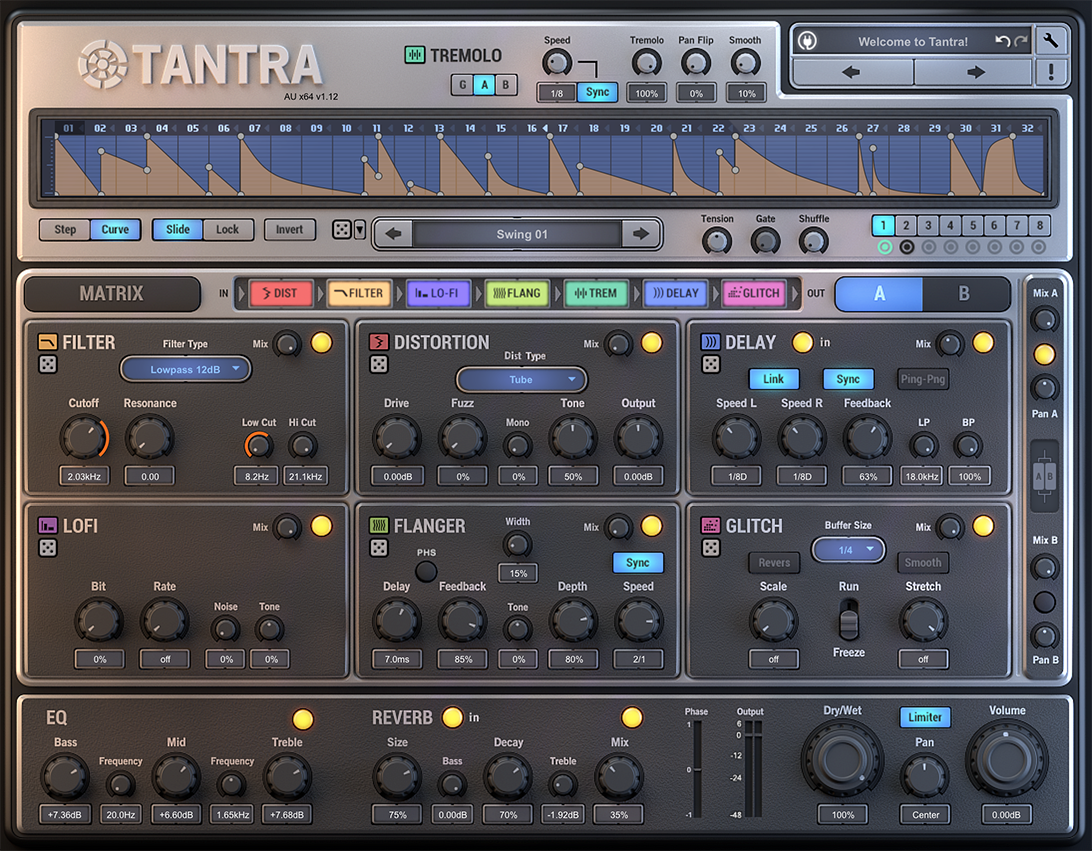
Satyatunes 'Glacier White' skin for Dune 2
-
- KVRAF
- 11035 posts since 19 Jun, 2008 from Seattle
You do not have the required permissions to view the files attached to this post.
I'm not a musician, but I've designed sounds that others use to make music. http://soundcloud.com/obsidiananvil
-
- KVRist
- 129 posts since 2 Sep, 2016
Hardware to me looks always like silly toys for children and nostalgia-seekers while appearing in software. Big shiny knobs, wood columns doing nothing, noisy textured metal surface, missing paint, dim LEDs and cartoon-like glowing tubes sometimes also. Parallax on knobs and this is a flat screen as it appears before me?? Foolish distractions from work and useless resource hogging ! No, I am not fooled by this ancient hardware appearance - I know that I use software.
Would prefer software to be software. Show me areas to click and to change values, show me plainly the information. Nature of this information you can imply using locations within signal flow and using words, icons and colors. I do not need silly pictures from real-world things to discern such functions, they are meaningless for me. Do not distract from sound with visuals.
Madrona Labs Aalto has this very good appearance from such practicality.
-
- KVRAF
- 4751 posts since 22 Nov, 2012
I don't think it's one way or the other, I think it depends on what the plug and the kind of information that needs to be presented, but that it should also feel like an instrument. So, a good GUI to me is a combination of the two. It should feel like an instrument, but take advantage of the computer screen and all the possibilities that presents. The SYLENTH1 GUI does that, the PLUGMON GUI for DIVA does that, and the GUI's for dune2 by Satyatunes do that. They need to be inspirational AND useful. Personally I like the way that synthmaster gives you both knobs and read out information that can be grabbed and manipulated, but the colors are not that great (needs purple) and I understand not many people like it, but It would be very difficult to give you that much information about all the aspects of an instrument like that without taking advantage of the flat style read outs.
-

- KVRAF
- 5677 posts since 25 Dec, 2004
i wish developers would stop putting links to their website on the logo of the synth.
At least tuck that shit into a menu or something,
it's stupid having browsers spring up when trying to escape a menu or the likes.
like hey, i'm using the plugin, i bought it from your site, i know where your site IS,
if i wanna go there i'll type your name into my browser, or click the link in my favourites.
sketches... http://soundcloud.com/onesnzeros
some artists i support... https://bandcamp.com/spectraselecta
some artists i support... https://bandcamp.com/spectraselecta
-
 gentleclockdivider gentleclockdivider https://www.kvraudio.com/forum/memberlist.php?mode=viewprofile&u=203660
 - KVRAF
- 6103 posts since 22 Mar, 2009 from gent
I am with you on this one .Zookes wrote:Hardware to me looks always like silly toys for children and nostalgia-seekers while appearing in software. Big shiny knobs, wood columns doing nothing, noisy textured metal surface, missing paint, dim LEDs and cartoon-like glowing tubes sometimes also. Parallax on knobs and this is a flat screen as it appears before me?? Foolish distractions from work and useless resource hogging ! No, I am not fooled by this ancient hardware appearance - I know that I use software.
Would prefer software to be software. Show me areas to click and to change values, show me plainly the information. Nature of this information you can imply using locations within signal flow and using words, icons and colors. I do not need silly pictures from real-world things to discern such functions, they are meaningless for me. Do not distract from sound with visuals.
Madrona Labs Aalto has this very good appearance from such practicality.
But it's a joy to create vintage looking guis in blender/ photoshop.
There's nothing wrong with gui looking like vintage hw. Problem is most overdo It and slap on Butt ugly shinny knobs etc...
Aalto is indeed a fine piece of art
Eyeball exchanging
Soul calibrating ..frequencies
Soul calibrating ..frequencies
-

- KVRAF
- 2275 posts since 4 Dec, 2011 from Brasília, Brazil
I wish developers stops putting virtual keyboards on their synths.sqigls wrote:i wish developers would stop putting links to their website on the logo of the synth.
At least tuck that shit into a menu or something,
it's stupid having browsers spring up when trying to escape a menu or the likes.
like hey, i'm using the plugin, i bought it from your site, i know where your site IS,
if i wanna go there i'll type your name into my browser, or click the link in my favourites.
My soundcloud: https://soundcloud.com/waltercruz
-
- KVRian
- 673 posts since 6 Dec, 2015
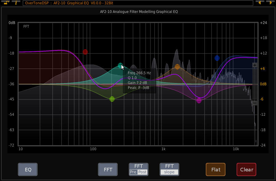
I don't think the standardEQ is an example of good design or someone explains me why it's necessary t have all the infos of each node at the same time. It clutters the space and pollutes the visual field with unnecessary information. Much better to present the details when one clicks on a node.Dasheesh wrote:
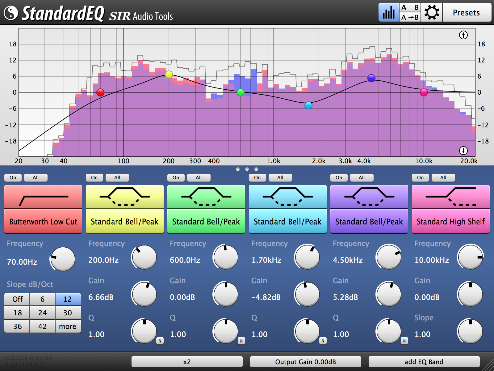
And the graph itself is nowhere near as good as the one above.
-

- KVRAF
- 5750 posts since 29 Sep, 2010 from Maui
Actually the analyzer in Standard EQ is fully configurable, as is most of the UI.
Not to mention it blows that EQ out of the water imo. I understand that's not
the topic here, I also can't say I would have listed it here myself.
-Cheers
I would have listed this probably:

Not to mention it blows that EQ out of the water imo. I understand that's not
the topic here, I also can't say I would have listed it here myself.
-Cheers
I would have listed this probably:
-

- KVRAF
- 10239 posts since 7 Sep, 2006 from Roseville, CA
Good call on the Drop ^^^
Logic Pro | PolyBrute | MatrixBrute | MiniFreak | Prophet 6 | Trigon 6 | OB-6 | Rev2 | Pro 3 | SE-1X | Polar TI2 | Blofeld | RYTMmk2 | Digitone | Syntakt | Digitakt | Integra-7
-

- KVRAF
- 3321 posts since 2 Jul, 2007
I agree. May we call this the "constructivist" theory of GUI design?Zookes wrote:Hardware to me looks always like silly toys for children and nostalgia-seekers while appearing in software. Big shiny knobs, wood columns doing nothing, noisy textured metal surface, missing paint, dim LEDs and cartoon-like glowing tubes sometimes also. Parallax on knobs and this is a flat screen as it appears before me?? Foolish distractions from work and useless resource hogging ! No, I am not fooled by this ancient hardware appearance - I know that I use software.
Would prefer software to be software. Show me areas to click and to change values, show me plainly the information. Nature of this information you can imply using locations within signal flow and using words, icons and colors. I do not need silly pictures from real-world things to discern such functions, they are meaningless for me. Do not distract from sound with visuals.
Madrona Labs Aalto has this very good appearance from such practicality.
I also want a large volume control on the face of every synth. Because you know why - how many times have you "inadvertently" programmed up something that went into cone-testing mode and you needed to drop the volume FAST to save your monitors and/or ears, but instead had to search around the GUI for the little tiny - but artfully designed - volume control?
-
- KVRAF
- 5677 posts since 25 Dec, 2004
yeah, gets my vote toocryophonik wrote:Good call on the Drop ^^^
sketches... http://soundcloud.com/onesnzeros
some artists i support... https://bandcamp.com/spectraselecta
some artists i support... https://bandcamp.com/spectraselecta
