
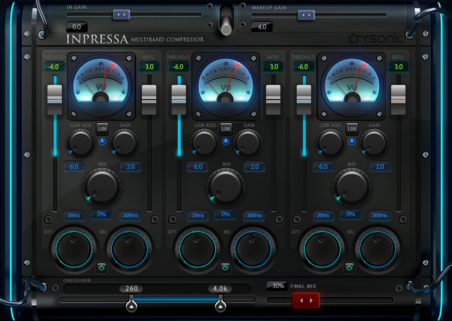

Favorite UI - most pleasing to the eyes...
-
 thecontrolcentre thecontrolcentre https://www.kvraudio.com/forum/memberlist.php?mode=viewprofile&u=76240
 - KVRAF
- 35171 posts since 27 Jul, 2005 from the wilds of wanny

-

- KVRAF
- 2281 posts since 25 Apr, 2009 from Doritos Land where no goblins are allowed
I forgot this one because I don't own a licence for it, but this is indeed one of the best GUI I know.Orbit-50 wrote:
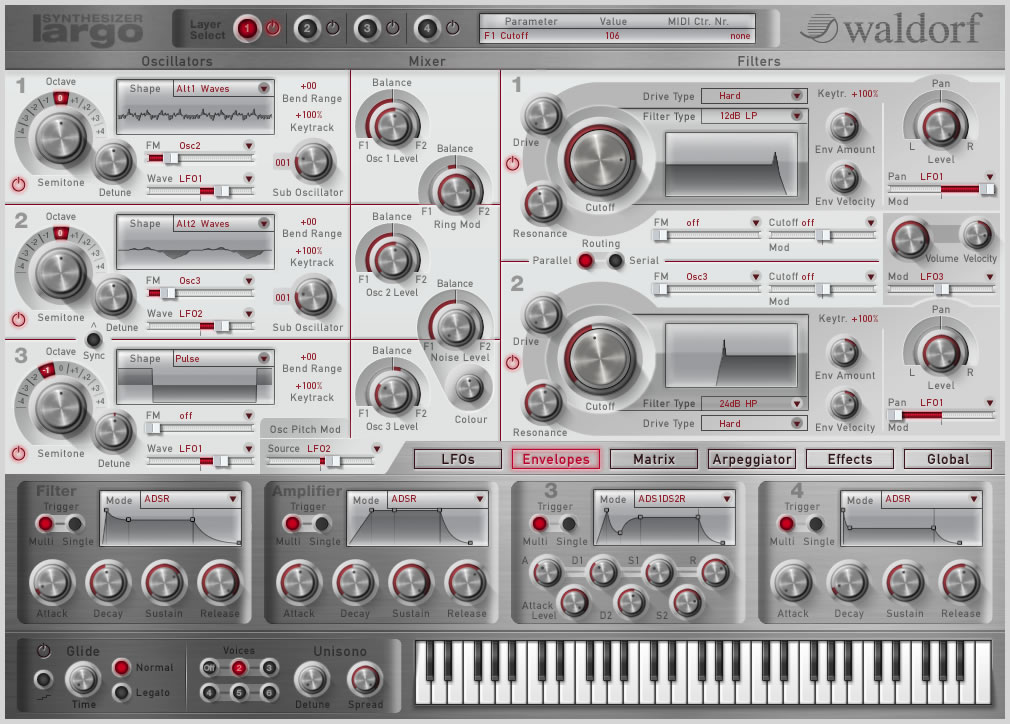
I also always love firing up Largo. I really love the classy pencil sketch theme of this plugin. Easy on the eyes and kind of trippy compared to the average plugin. Joy to use.
Please don’t read the above post. It’s a stupid one. Simply pass.
-

- KVRAF
- 4590 posts since 7 Jun, 2012 from Warsaw
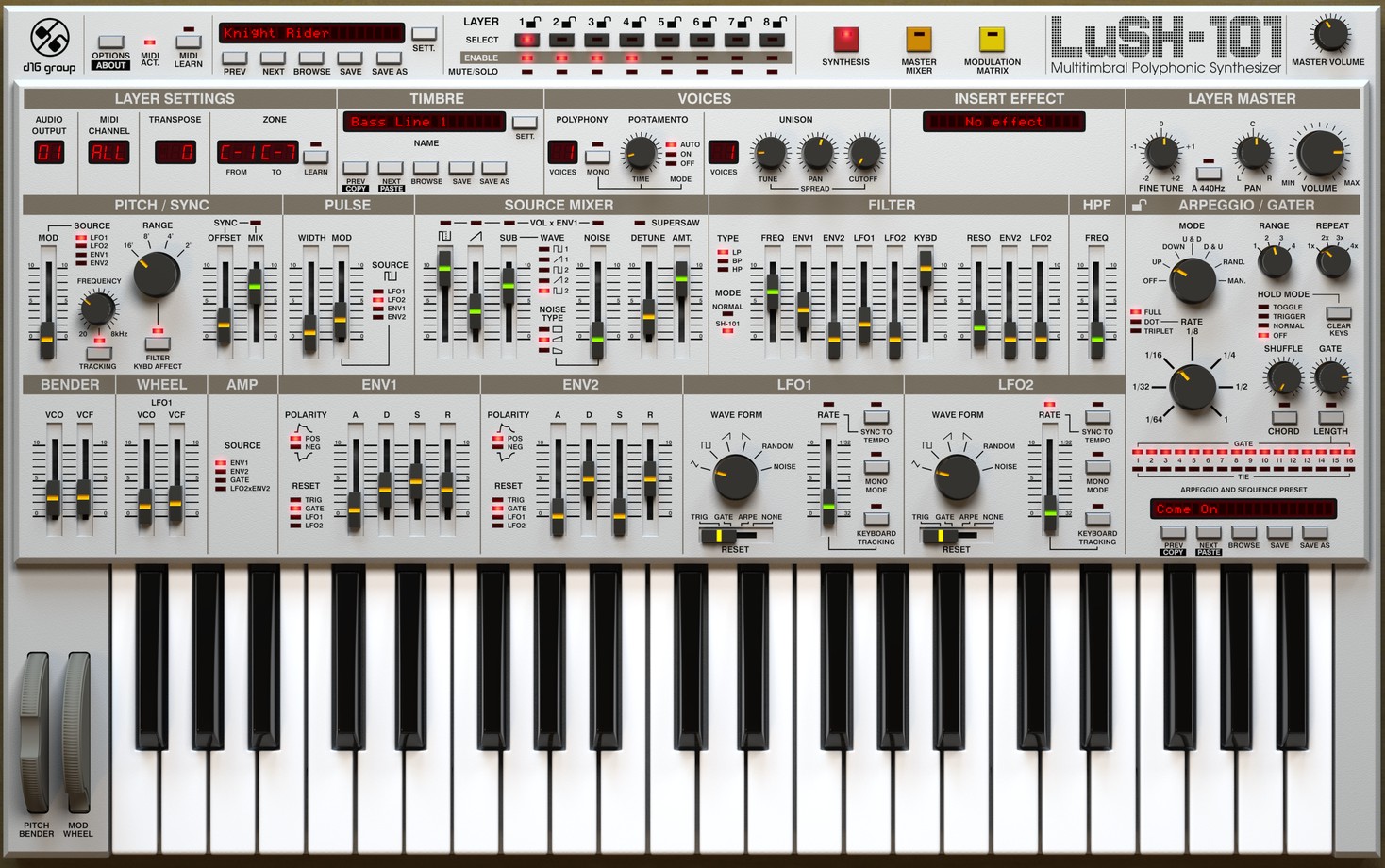
+1 to LuSH. That is, in large mode, otherwise it's difficult to read some labels.thecontrolcentre wrote:
Blog ------------- YouTube channel
Tricky-Loops wrote: (...)someone like Armin van Buuren who claims to make a track in half an hour and all his songs sound somewhat boring(...)
Tricky-Loops wrote: (...)someone like Armin van Buuren who claims to make a track in half an hour and all his songs sound somewhat boring(...)
-
- KVRAF
- 35436 posts since 11 Apr, 2010 from Germany
Yep. Also, because the important modulation options are right in the respective sections, and not somewhere hidden in the matrix. U-he synths do feature that too though, and it makes working really fast.DJErmac wrote:I forgot this one because I don't own a licence for it, but this is indeed one of the best GUI I know.Orbit-50 wrote:
I also always love firing up Largo. I really love the classy pencil sketch theme of this plugin. Easy on the eyes and kind of trippy compared to the average plugin. Joy to use.
-

- KVRAF
- 5485 posts since 15 Dec, 2011 from Bucharest, Romania
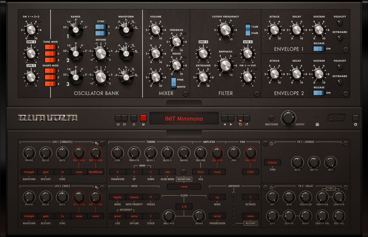
You have to buy it.fmr wrote:Looks greatshroom81 wrote:This skin for Diva is the best!
Is it available in the usual repository?
-
- KVRAF
- 5179 posts since 16 Nov, 2014
-

- KVRAF
- 6113 posts since 7 Jan, 2005 from Corporate States of America
Ha ha ha ha ha ha....jon wrote:Almost all fake 3D GUIs look much worse, but your opinion is common for those who have learned nothing of UI design.Jace-BeOS wrote:Yes. There are a ton of GUIs like that on mobile. Some vectorial GUIs on mobile are usable, but most look like copy/paste from everyone else. There's no distinctiveness. A few have such a usable set of controls and/or brilliant utility that I will buy it and enjoy it fine enough (like Fugue Machine), but I actually decided I wouldn't purchase any apps with GUIs that feel like a mockery of everything humanity should've learned by now of UI design.layzer wrote:you mean the pre-school friendly, after thought, rough draft is sufficient ones?Jace-BeOS wrote:I'm happy to see no representation from the "flat and minimal" camp
- dysamoria.com
my music @ SoundCloud
my music @ SoundCloud
-
- KVRAF
- 6113 posts since 7 Jan, 2005 from Corporate States of America
Maybe you should do some reading on what skeumorphism is. http://gizmodo.com/skeuomorphism-will-n ... 1642089313rod_zero wrote:Yeah, skeumorphism is the one that goes against good UI most of the time.
Skeumorphism has a place and is often necessary. It can be done well or done badly. Even in Apple's ugly post-6-iOS, skeumorphism is plenty present (just because it's not photorealistic doesn't mean it isn't skeumorphism).
Eliminating skeumorphism for the sake of hating skeumorphism, is ignorant design.
- dysamoria.com
my music @ SoundCloud
my music @ SoundCloud
-
- KVRAF
- 35436 posts since 11 Apr, 2010 from Germany
Ugh... the whole point of consistent GUI design on mobile devices is that they shouldn't be too distinct from each other. You know, it makes it easy to handle software of different origin, when it more or less looks the same. That's why Android has its own design scheme and guidelines, but also Windows, MacOS, Linux in most cases... i wouldn't know why software has to be distinctive looking, it's much better when you have a coherent design, so you don't have to work yourself in, with every single new program.
-
- KVRAF
- 6113 posts since 7 Jan, 2005 from Corporate States of America
The forms in this are very nice, as is the layout, but the contrast is a bit of a problem, especially with low resolution text. I really wish software companies would embrace high-PPI displays already. I know Windows devices need to be sold with high-PPI displays in order for anyone in the industry to take serious notice...Orbit-50 wrote:
I also always love firing up Largo. I really love the classy pencil sketch theme of this plugin. Easy on the eyes and kind of trippy compared to the average plugin. Joy to use.
- dysamoria.com
my music @ SoundCloud
my music @ SoundCloud
-
- KVRAF
- 6113 posts since 7 Jan, 2005 from Corporate States of America
You can have distinctiveness without throwing away common design schemes in an OS. I'm a fan of software using the native API, UI objects, and behaviors as much as possible. It's bad form to constantly reinvent the wheel and to create inconsistent behaviors. The hotdog gimmick GUI does not break conventions when it offers a set of non-OS knobs because the knobs are familiar as knobs immediately (and I presume they operate like knobs operate, but I've never used that plugin).chk071 wrote:Ugh... the whole point of consistent GUI design on mobile devices is that they shouldn't be too distinct from each other. You know, it makes it easy to handle software of different origin, when it more or less looks the same. That's why Android has its own design scheme and guidelines, but also Windows, MacOS, Linux in most cases... i wouldn't know why software has to be distinctive looking, it's much better when you have a coherent design, so you don't have to work yourself in, with every single new program.
More importantly, the distinctiveness I'm looking for is that which should exist between controls, labels, decorations, and displays so that people can easily tell what everything IS. The minimalist flat trend makes it hard to tell what is a control and what is not. It has reduced touch (and mouse) targets to ridiculously tiny surface areas, created greater likelihood of touching the wrong object, and negatively impacted users' ability to intuit how a control is meant to be operated (if they can tell it IS a control).
For example of that last point: iOS 7 destroyed Apple's unique mobile take on drop-down list boxes by removing all sense of depth; where there was once a clear design of a wheel to spin, they now just look like solid white spaces with text, not something you can figure out how to interact with unless you were already familiar with this control and presumed that it still behaved the same as it used to. This "design" a result of keeping the functional skeumorphism (it's still operated like a wheel) while stripping the visual skeumorphism (the visual cues). This is the absolute worst way to do UI design. It wasn't a "re-design" at all. It was a skinning process where the new visuals ruined the originally intended function. It takes prior experience to know WTF is going on there and new users are faced with cognitive clutter (yes, flattening a UI creates clutter while it claims to remove it), not knowing WTH they are looking at or what to do with it.
- dysamoria.com
my music @ SoundCloud
my music @ SoundCloud


